Some of our most important readers are in their seventies and eighties. The
museum’s quiet grey captions on a dark wall — beautiful at arm’s length on a
bright screen — can be genuinely hard for them to read. The reading-comfort
dial answers that without touching the designed look for anyone who doesn’t
need it: the choice is personal and per device. Each visitor sets their
own comfort; the museum remembers it on that device; nobody else’s view
changes.
Open the Story Collections room with a curator account. The dial sits in the
top bar — four steps, drawn as a small rising staircase. Click a step and the
room changes immediately; your choice is kept on that device.
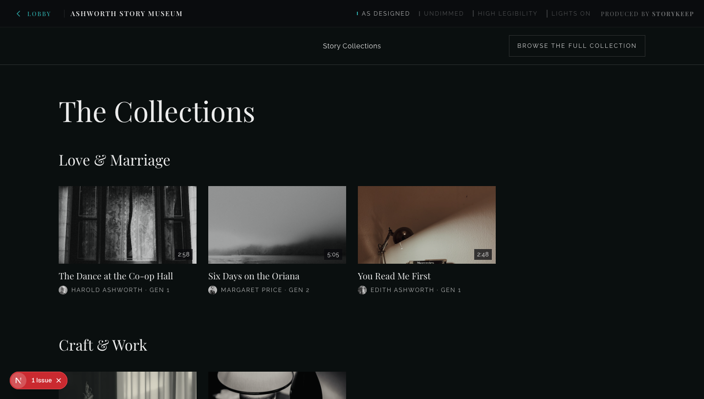
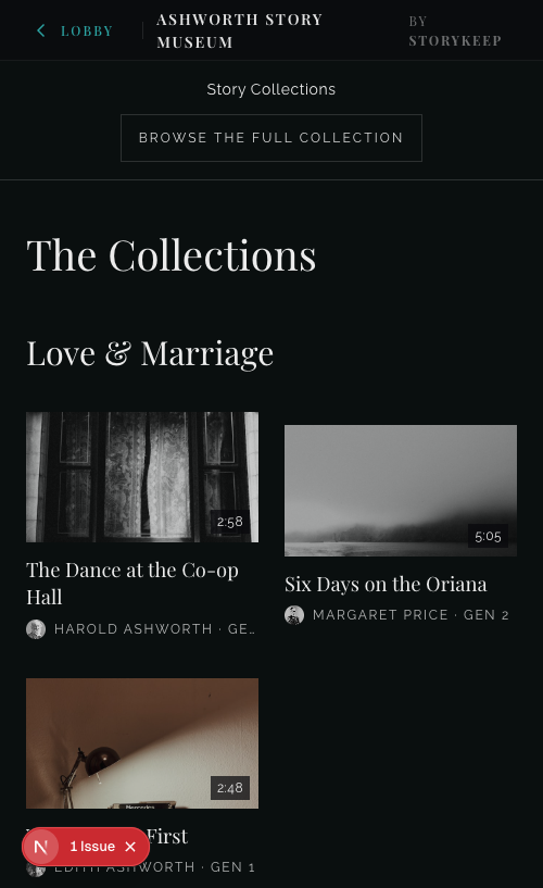
- As designed — the museum exactly as curated. This is, and stays, the
default for every visitor.
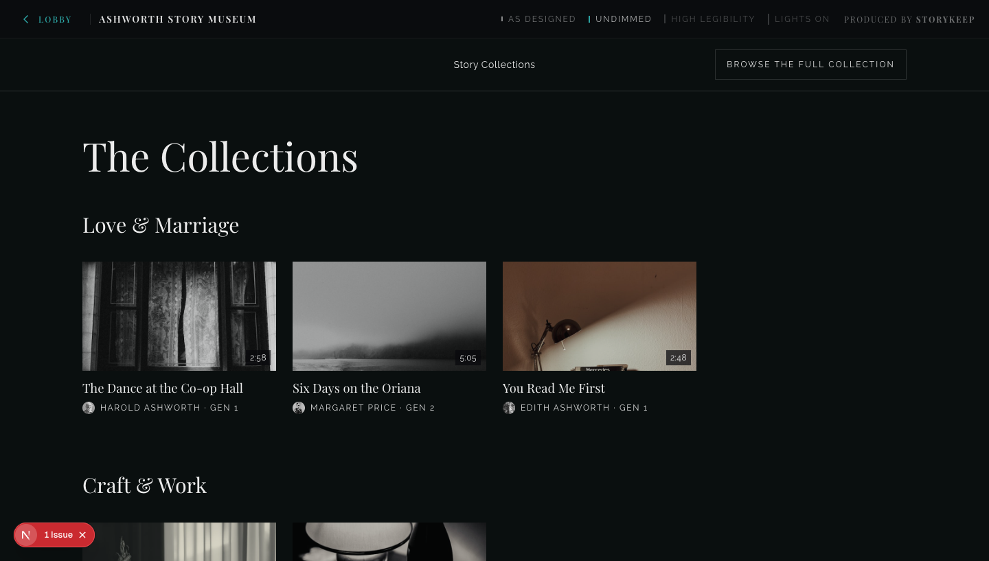
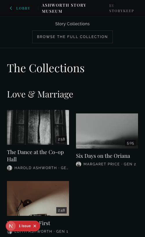
- Undimmed — the quiet grey text comes up to full brightness. Hierarchy
is carried by size and typeface instead of dimming.
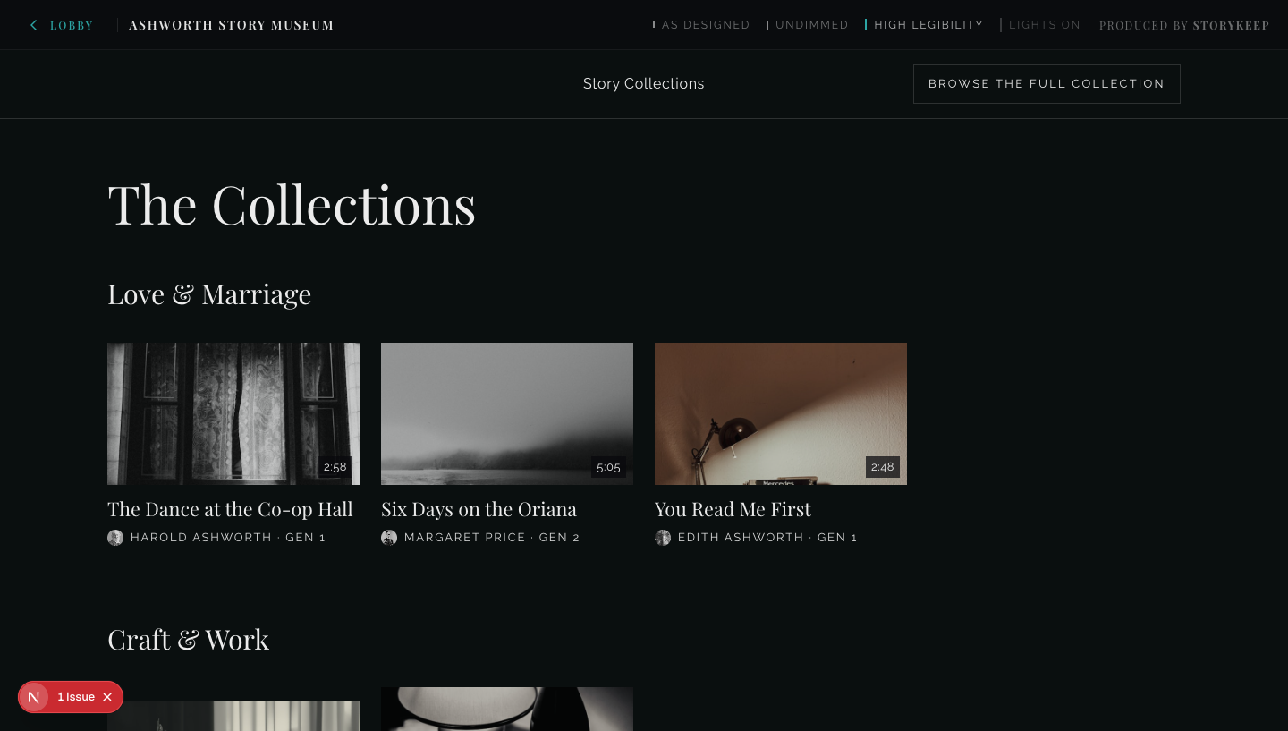
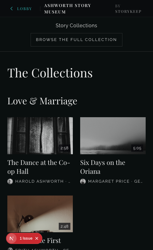
- High legibility — undimmed, plus a larger reading ramp: body text,
labels, and card titles grow where legibility is actually won; the big
headings move only a little so nothing overflows on phones.
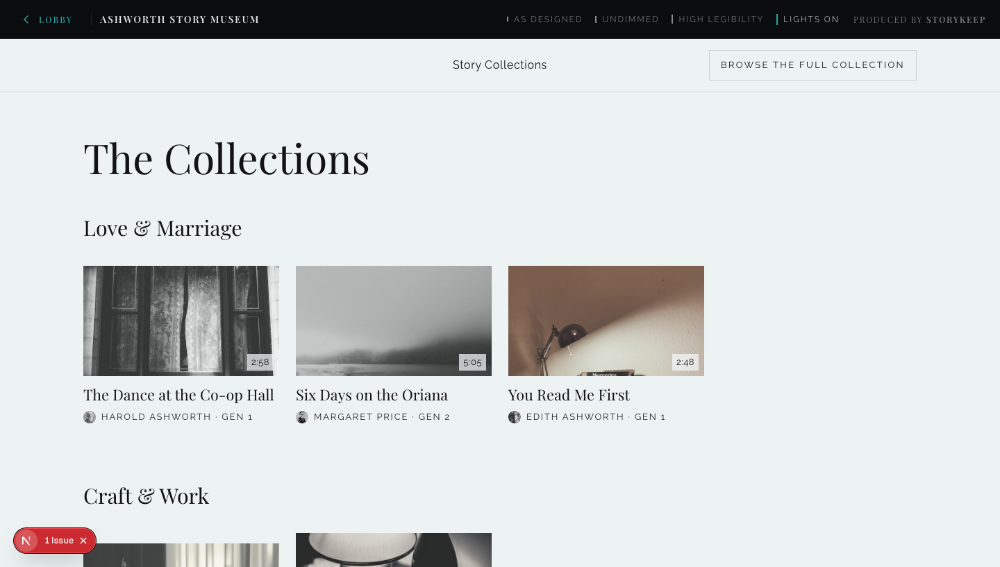
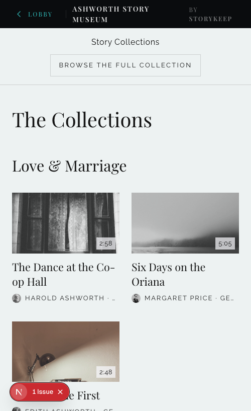
- Lights on — everything above, plus a light wall: dark text on a bright
ground, photographs in true color. Deliberately an instrument, not a
finished design — it exists so we can judge whether a properly designed
light mode deserves a place on the roadmap.
| As designed |
Undimmed |
 |
 |
| High legibility |
Lights on |
 |
 |
| As designed |
Undimmed |
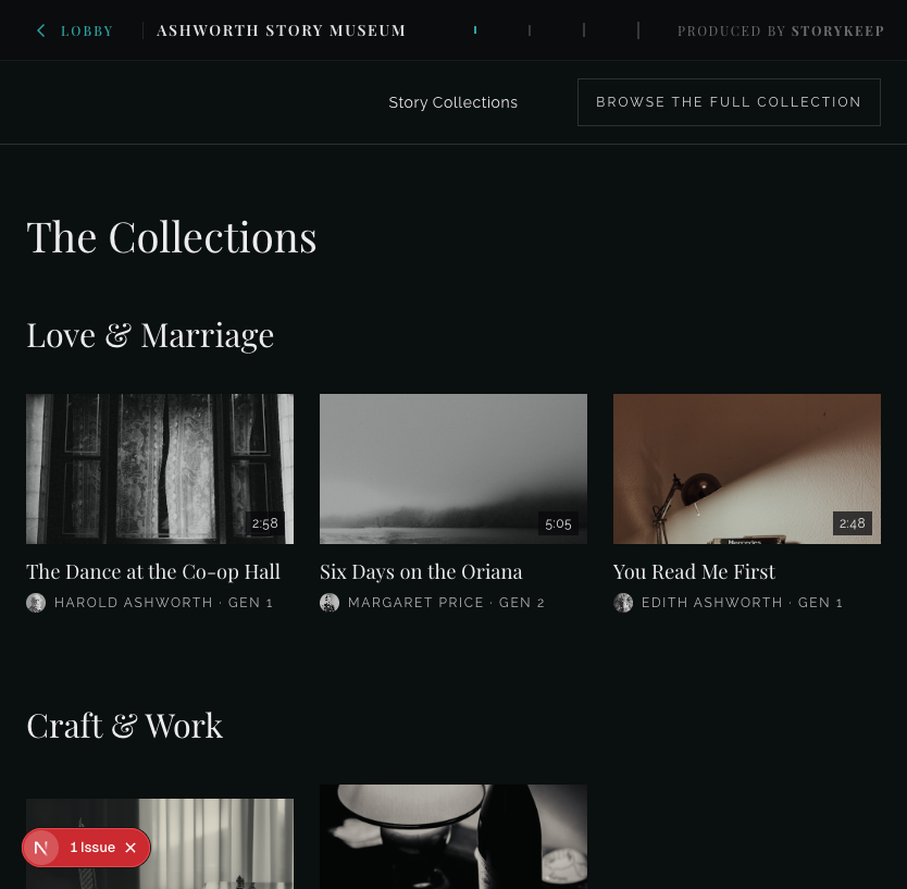 |
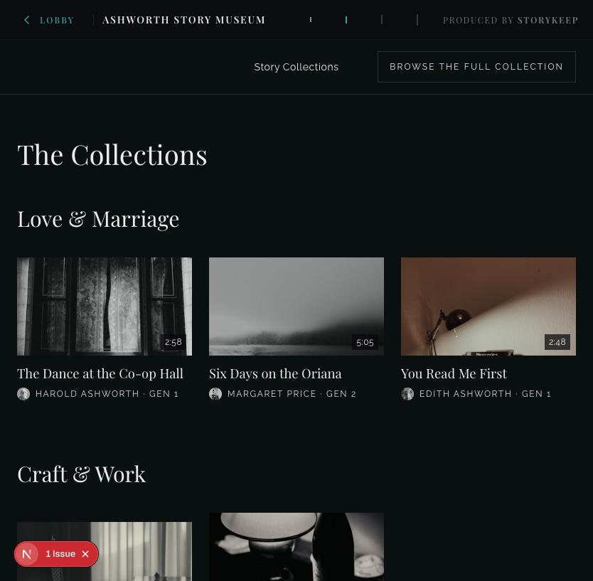 |
| High legibility |
Lights on |
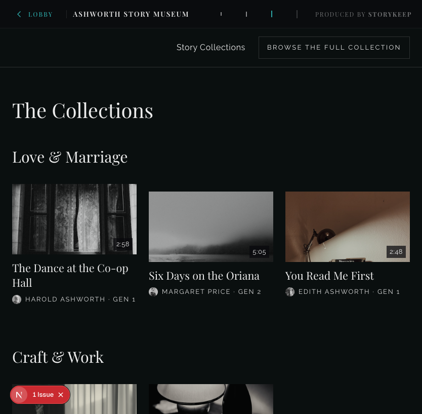 |
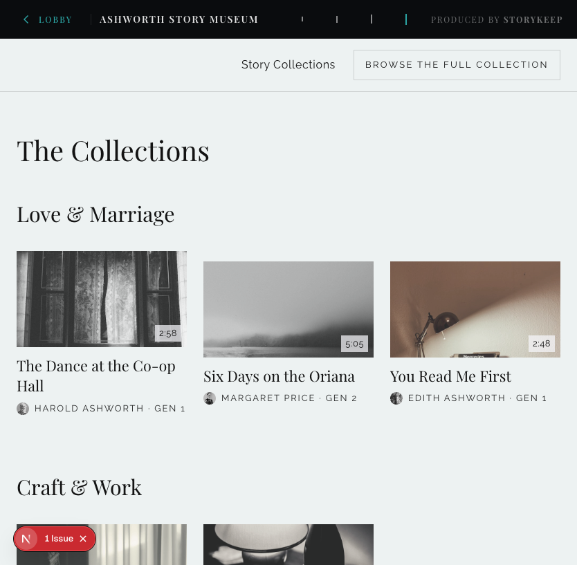 |
| As designed |
Undimmed |
High legibility |
Lights on |
 |
 |
 |
 |
- On which device and step does reading genuinely become comfortable —
especially for the oldest readers?
- Is Lights on promising enough that a properly designed light version
deserves a place on the roadmap, or does High legibility already cover
the need?
- Does any wording on the dial not feel like the museum speaking?

